Painting a Layered Nursery Mural for My Niece, Emily
If you’ve ever searched “nursery mural inspiration” on Google or Pinterest, I’m sure you’ve seen a common theme containing a layered mountainscape. In its concept, this is a simple design that’s relatively easy to recreate and incorporate personal details into. In this blog, I’m going to walk you through the process of how I designed and implemented this type of mural for my baby niece, Emily. At the end of this post, you’ll find a free mural painting supply list available for download, so you can try this project at home! And if you think this type of design looks familiar, it’s because I also used this layered mountain design for my Star Wars nursery mural which you can read about here. Comparing these two designs, you can see how variable this concept can be! So without further ado, here’s the process of transforming my niece’s nursery into a calm oasis.
The weekend after painting this utility box in La Mesa, California, I set out to paint another mural, this time for my niece. As a muralist, it’s typical to experience periods of time with no work followed by an intense few weeks of painting. And this just so happens to be one of those busy times! Although I started painting this nursery mural after the La Mesa utility box, the ideation process for this one actually started weeks prior. My sister regularly collaborates with an interior designer to decorate the rooms in her house, so my goal was to first assess the current space and furniture, gather personal inspiration, and illustrate some digital mockups to get us started.
I should also mention that at the start of this project, I had no idea what my niece’s name would be! Because she came into this world a few weeks early, I chose to paint this mural as soon as I possibly could so that my brother-in-law could finish setting up the nursery and have it ready when my sister and the baby came home from the hospital.
ideation/digital mockups
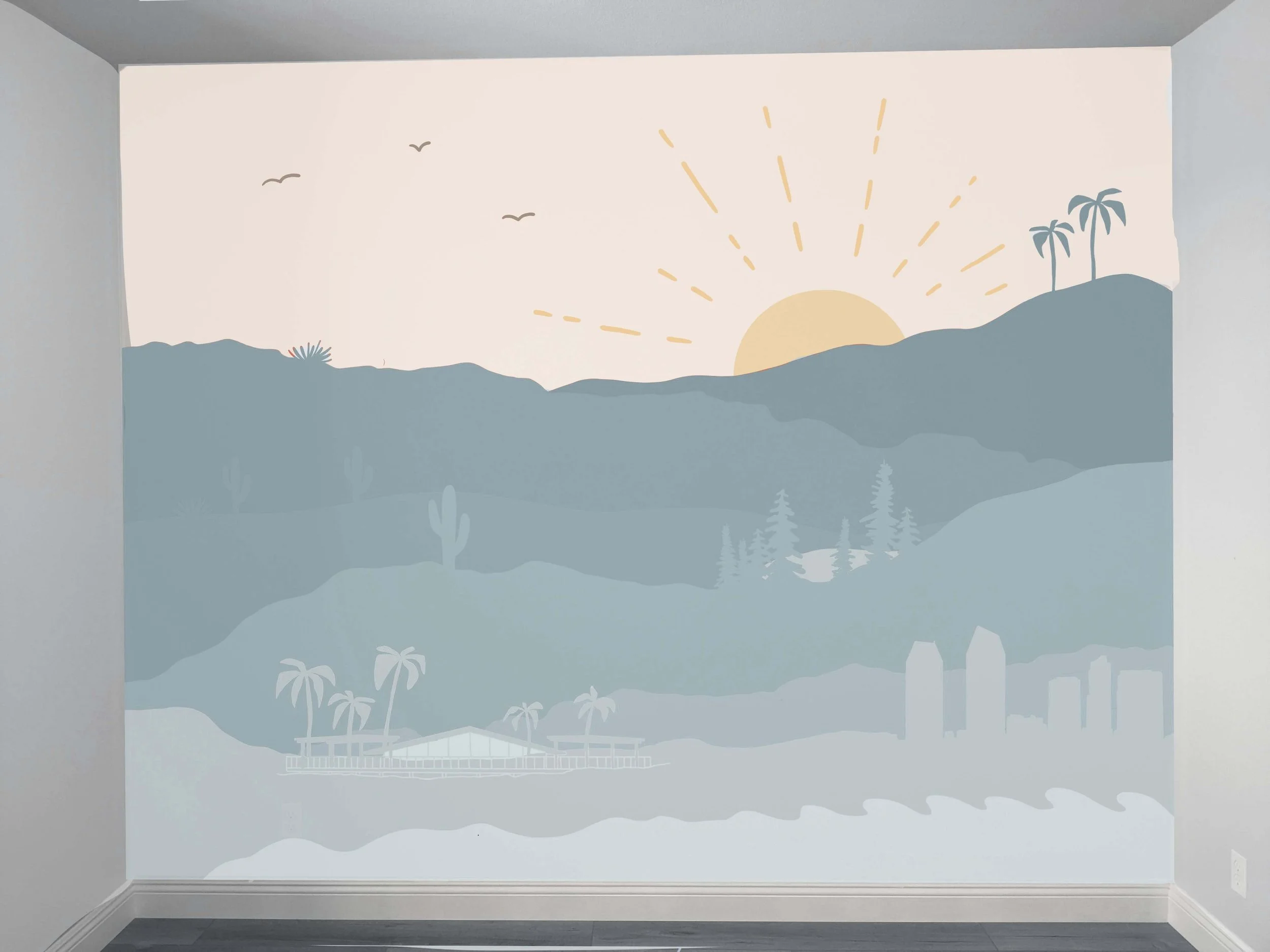
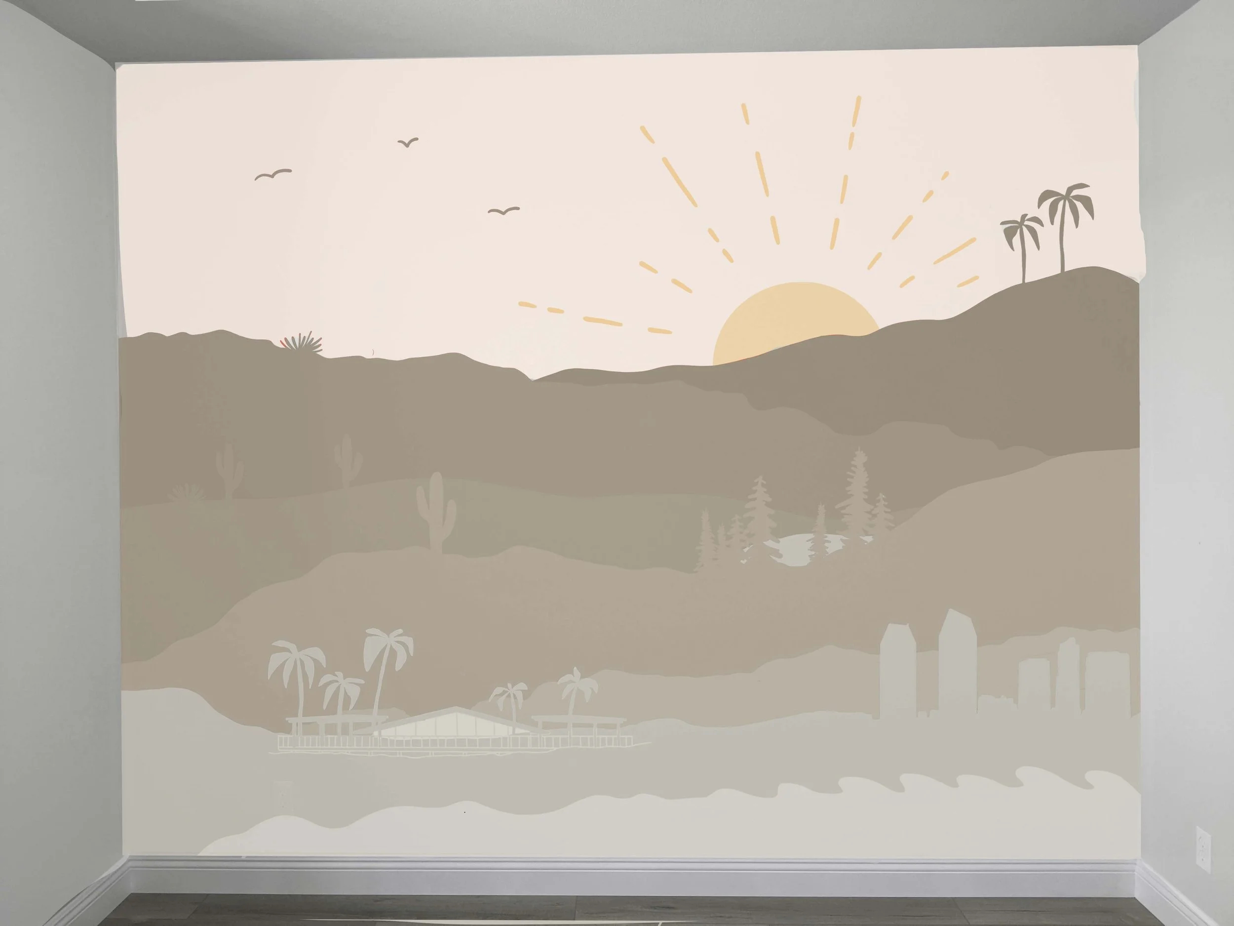
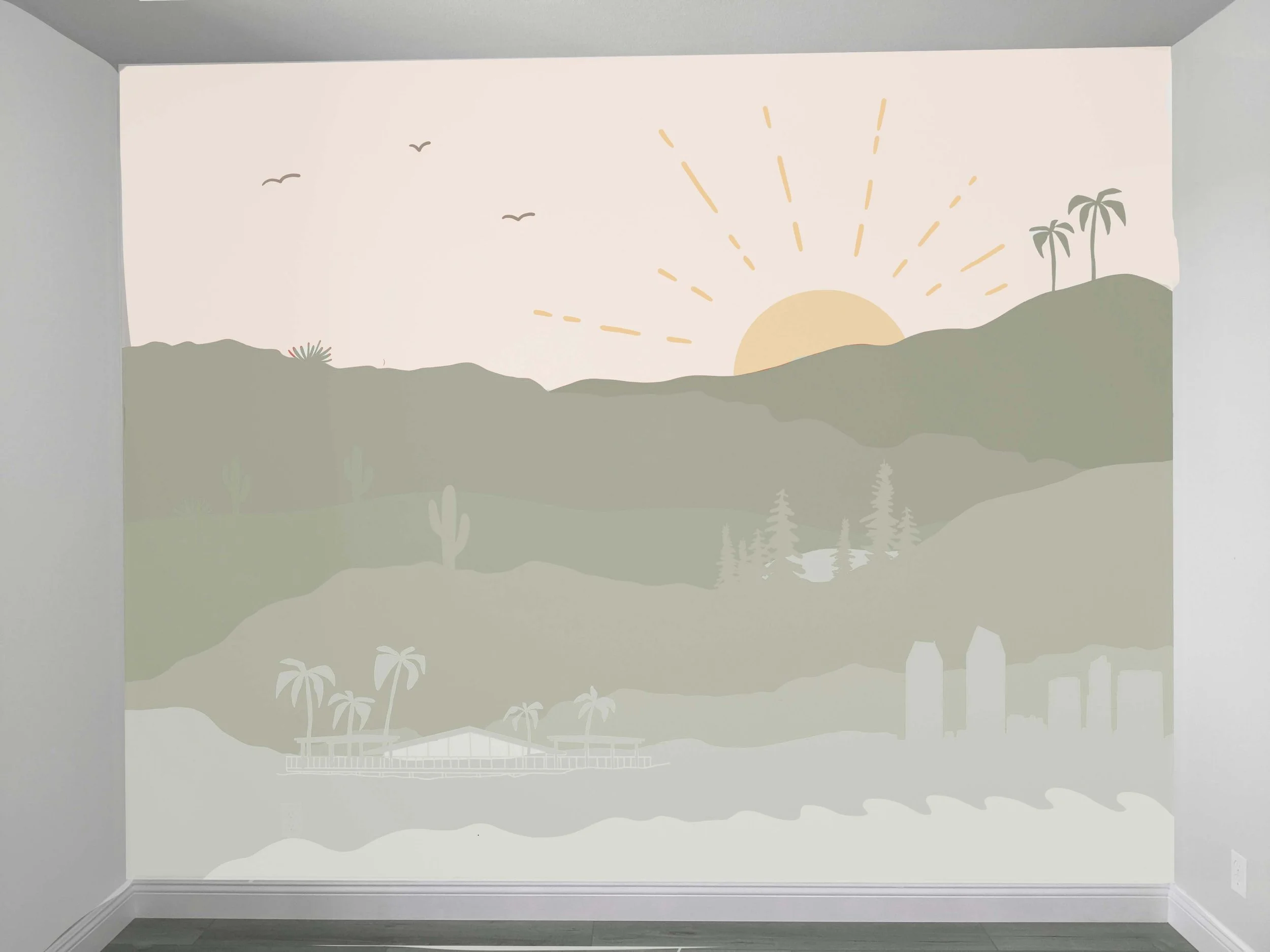
After drawing a few digital mockups, I sent the ideas over for my sister to review in order to get a feel of what her intended vibe of the room was. Ultimately we decided to go with a layered design in which I would incorporate details into referencing locations my sister and brother-in-law cherish: where they grew up, spent many summers, got married, and currently reside. Their decorative style is modern and simple, so we wanted this design to have a more grown-up feel than you would typically see in a nursery - while retaining personal touches. I always like to give people several options to choose from, so I sent over the second mockup concept in four color variations.
mural prep + gathering supplies
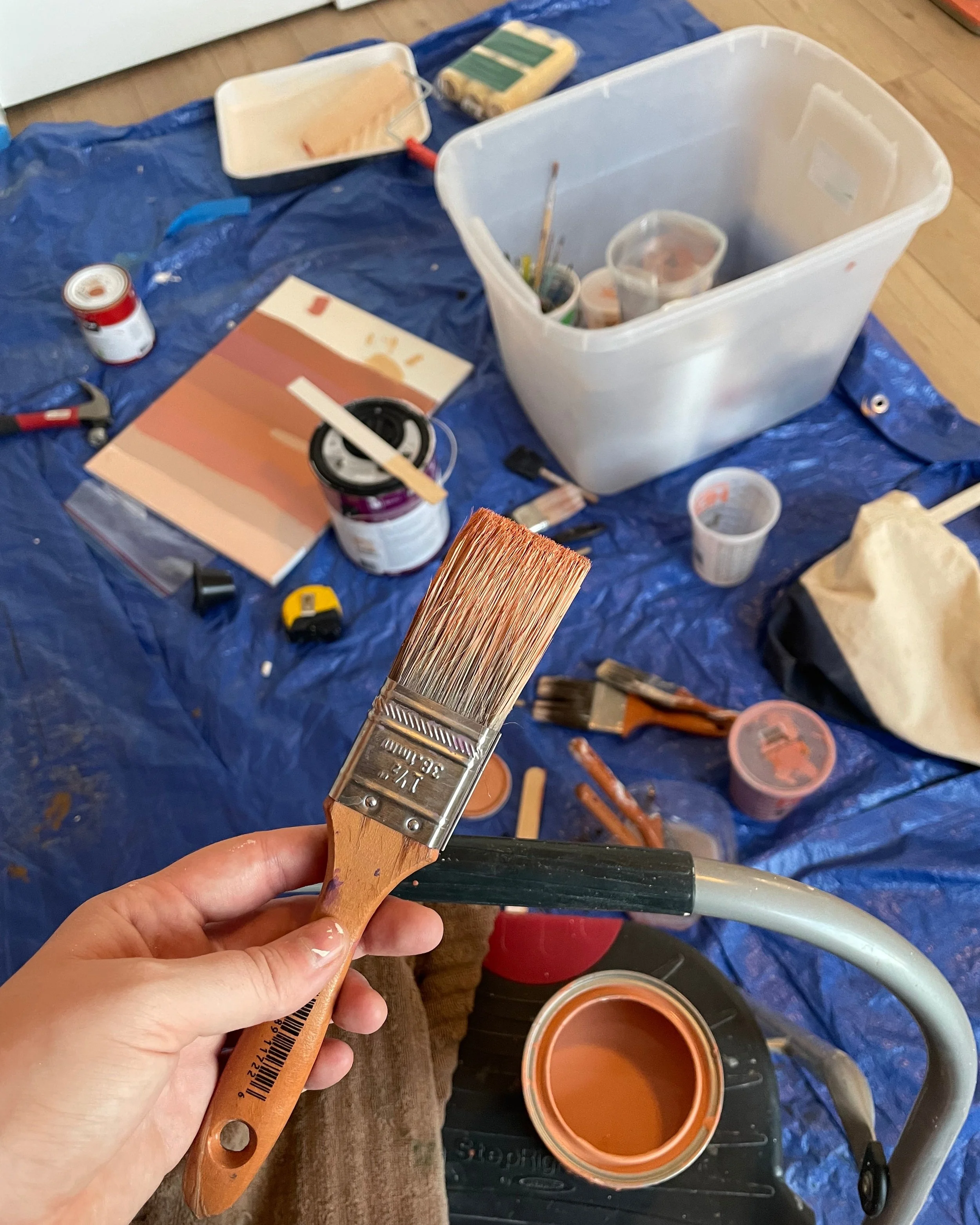
After they selected the muted red mockup, I scheduled a time for the mural installation. I like to get this on my calendar as soon as possible so I can plan for materials and also give people enough time to prep their space. This includes making sure the area around the wall is clear and that all holes or dents are filled in. My work schedule allows me to have Fridays off, where I’m free to dedicate time to my art practice. So I started the weekend early Thursday evening by developing a supply list and going to Home Depot. I spent a long time staring at paint samples (I now know that I can do this process online, so that will save me about 20 minutes in the future). While waiting for my colors to mix, I also picked up plastic quart containers, a couple of new brushes, paint stir sticks, and a new foam roller.
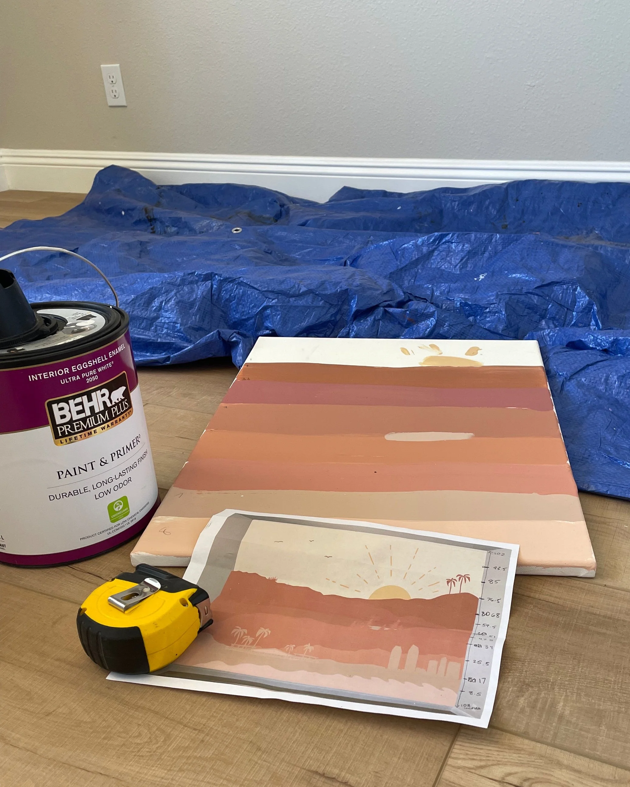
Once home, I started to mix my in-between colors. I bought four quarts of paint but had nine layers of color for my mural, so I used five extra quart containers to mix and store my additional colors. I did this in an attempt to save some money, but in hindsight, buying sample sizes instead of quarts might have made my life easier. Once I mixed each layer to the shade I wanted, I painted swatches onto a small canvas. While that dried, I gathered up all my materials and went straight to my sister’s house. I really wanted to see how the sample colors looked in the actual room because sometimes the amount of light in a space can change the way the colors are perceived.
At the mural site, I began by wiping the wall of any dust and taping off all the edges. I then sealed the edges of the tape with the original tan wall color (I heard this could help in keeping the lines clean and crisp, but I would skip this step next time). After laying down my tarp, I measured the height of the wall and compared that to my digital mockup. I then used those measurements to proportion out where each layer would go and sketched these guidelines onto the wall with a piece of chalk.
let’s put paint on the wall
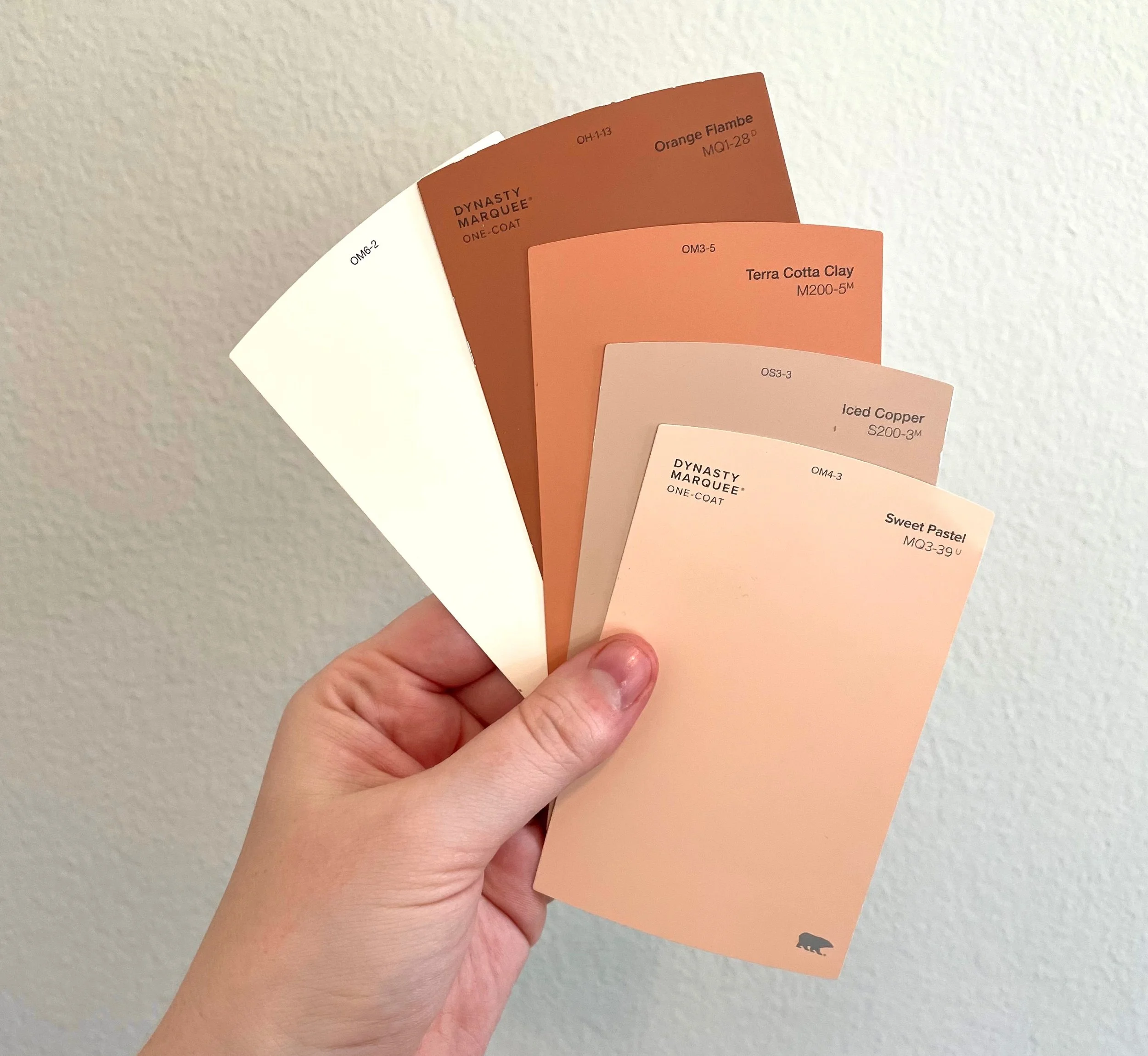
Starting off with the top layer, I painted a light cream color for the sky. I then started on the first mountain layer in Terra Cotta Urn by Behr. (Unfortunately, I ended up having to paint over my third layer but didn’t realize that at this time.) I took a quick break and painted two more layers before calling it quits for the day. I felt satisfied with my progress and went home to go to bed early so I could start fresh the next day.
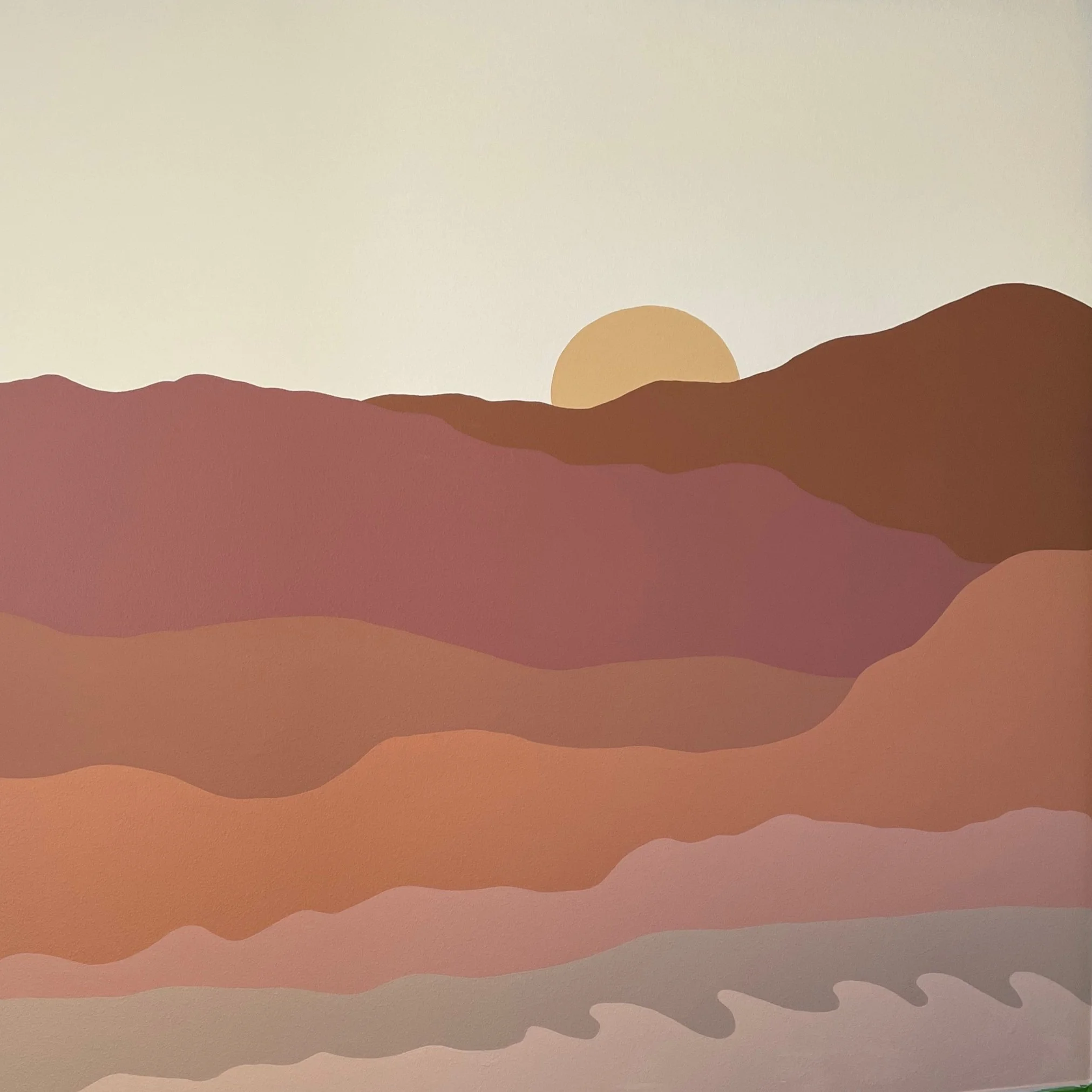
When I arrived Saturday morning, I immediately noticed that the saturation of a couple of layers was more intense than I anticipated. Wanting to power through the project, I finished painting the bottom layers before taking a step back and observing the wall as a whole. At this time I knew something was totally off about the colors, but still continued on by sketching a few icons in chalk to see how I felt. I then reexamined the wall again and decided it was mostly just two layers throwing me off. I went back to my paint, remixed it, and painted new layers over those two sections before taking a lunch break. Here’s a side-by-side of the mural before and after fixing just those two layers. I really think it made all the difference!
before/after repainting two layers
Before
After
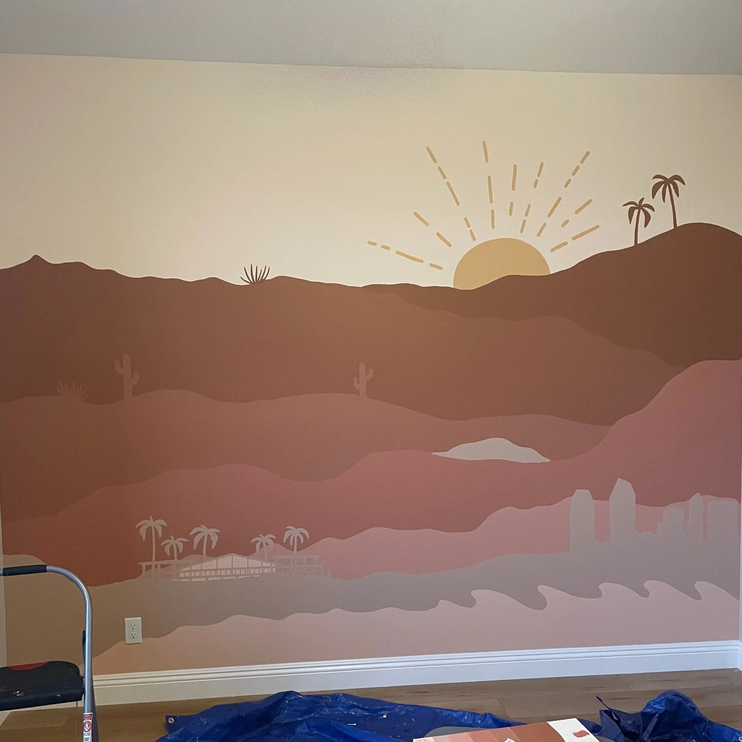
From here, I needed to add in the details. The icons I included were palm trees, cacti, forest trees, a lake, a cityscape, and the place my sister and brother-in-law were married in San Diego. This process usually requires a combination of methods to transfer my intended image onto the wall. For this project, the palm trees required a paper stencil, but the resort and cityscape were achieved with the help of a projector. While some parts of the wall were still drying, my impatient self decided to take off all the blue painter’s tape and pull back the tarp so that I could view the mural in its entirety. If this were a commercial job, I would take all my photos at this point and quickly clean up my materials. But because this was my sister’s place, I snapped a few quick pics and left my mess for another day.
My true reasoning for waiting to take pictures until Sunday was to utilize that gorgeous, natural morning light. I painted a few more details, cleaned up the rest of my supplies, and took as many photos as I pleased. Ideally, I try to capture as much content as possible to use on my social media, website, and emails. Once all my photos were taken, I called my brother-in-law in to have him look at the results and texted my sister a few photos. Remember, at this time she was still in the hospital, so she didn’t get to see the room until it was fully furnished!
pictures of the completed mural
Overall I’m very pleased with this mural and love how it adds life, color, and meaning to this space while also complimenting the room’s modern and natural vibe. I’m happy to say that my niece arrived into this world as a healthy little baby, and she’s officially got one of the coolest rooms ever! I’m so happy I was able to do this for her, and I hope she connects with this mural as she grows up and finds her own meaning in the colors, layers, and images.
reflection
TBH, the color process of this mural was rushed. Many tweaks were made to the digital mockup towards the end and it was my error in not making sure I had the correct reference with me. Every project has a lesson to teach, so this one served as a reminder to make sure my colors are 100% where I want them before starting. Next time, I’ll also use paint samples instead of buying quarts of paint and mixing those together. These samples are smaller quantities of paint that you can purchase from any supply store and allow for each color to be exactly what you want.
I think at the beginning of my mural career, I leaned towards the idea that I would save money by buying fewer colors in larger quantities and mixing those together. But house paint doesn’t always mix the same as acrylic (like I’m accustomed to) so the color match isn’t always 100%. Now I’m thinking that time is money and I’d rather save myself the efforts of re-painting sections of the wall. I could’ve also spent more time testing my colors on the smaller canvas, so I will keep that in mind for future mural projects. And as promised, here’s that free supply list PDF for you to download.
Thanks for reading. See ya next time!
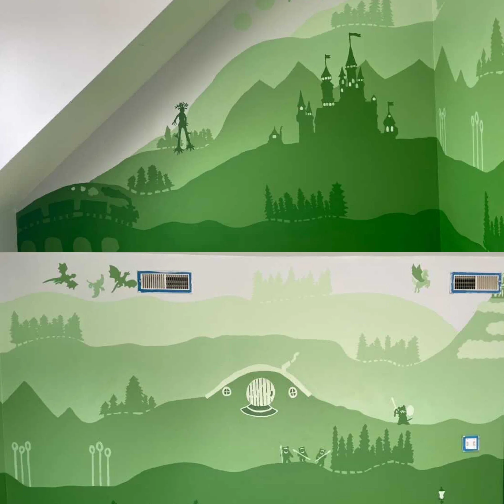
This style of mural is something you - yes YOU - can do! Here are two murals from people just like you who were inspired by my other Star Wars layered mural and decided to make one of their own. I’m so happy to see people tackling their walls with confidence and creating custom, meaningful murals in their homes.
Because of this, I created a separate blog called “How to Paint a Layered Mural in 10 Easy Steps” which takes you through the process of ideation, picking colors, and painting on your wall. Check it out >>
layered murals inspired by my star wars design
“Will you just look at the masterpiece [my husband] has created, inspired by the amazing Becca Dwyer Design for Lilibeth’s bedroom!? He’s poured his heart and soul into this and it really shows. I love it so much and we are never decorating this room ever again. - Steph Harley @ministeph19
“I saw the beautiful fantasy-inspired mural that you painted and I was OBSESSED. I saved it and kept coming back to the idea for months. We decided to use it as inspiration for our own nursery, and wanted to say thank you for sharing your art and creativity across platforms.” - Ianna Drew @iannadrew


