Branding a Fake Company
I’m going to be real with you. In order to make the transition from full-time office job to running my own business, I’ve been looking for remote, part-time graphic design work. While I would love to spend all of my time growing as a design business, it seems more realistic to search for a part-time job while I get myself up off of the ground.
The job search has been slow, thanks to the global pandemic, but a couple of weeks ago I applied for a part-time, Graphic Design position at a small marketing company located in downtown San Diego. The job description looked ideal for my situation and I applied right away. Unfortunately, I didn’t get the job. I wanted to make sure you knew that before proceeding. It’s always a bummer to hear that a company doesn’t want to move forward with you, but I know I’ll be okay and I’ll continue to apply places I think would be a great fit. So, what exactly are we doing here?
Although I didn’t get the job, I did complete 3 out of 4 steps in their interview process. The first was a basic common-sense assessment test. The second was 30 minute phone interview. The third and final step I completed was a design test, and that’s what this blog post is about today. A design test allows a potential employer see how you interpret an idea and how you create as a designer. I could sit on the phone and discuss my skills all day, but you can’t fudge your way through a design test.
After the phone interview, the company emailed me a 2 page document detailing branding instructions for a fake snack-based subscription box called PotatoTater. This fake company provides their subscribers with potato-based snacks from all around the world. In order to complete the design test, I had two days to come up with a logo, color palette, fonts, and mockup 2 pages of PotatoTater’s website. The idea is that this fake company is looking for investors and has asked me to provided these design assets before their big ($$) meeting.
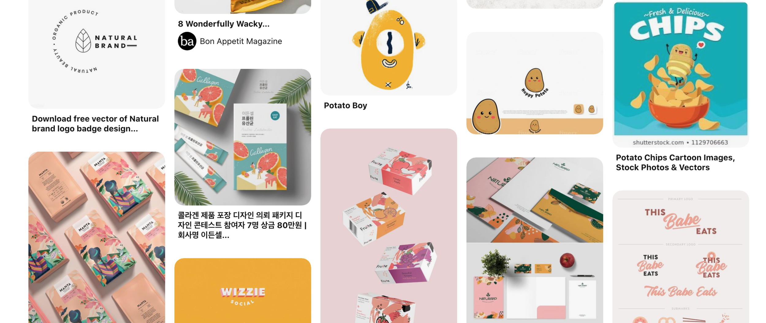
While I was a bit intimidated, I knew the only way was forward, so I grabbed my sketchbook and wrote down all of the important information I needed to include in my final design. I then took to Pinterest where I put together a mood board of inspiration. The purpose of the mood board is to collect an assortment of images that capture the “look and feel” of the brand you’re creating for. A brand is more than just fonts and colors, it’s curating an experience that feels authentic and trustworthy. In the design test document, it described PotatoTater’s branding as “fun, approachable, unique, bold, and great for adventurous potato-loving snackers of all ages”, so these are the search terms I used to find relevant and inspirational images.
My Pinterest mood board for PotatoTater
After I completed the mood board, I went back to my sketchbook and started brainstorming logo ideas. I finally decided on making the potato aspect the main focus of the logo and took my sketch into Procreate on my iPad. At this point, I didn’t even know if I liked my idea, but I knew time was limited and I just needed to keep going so I could complete the other tasks in the test.
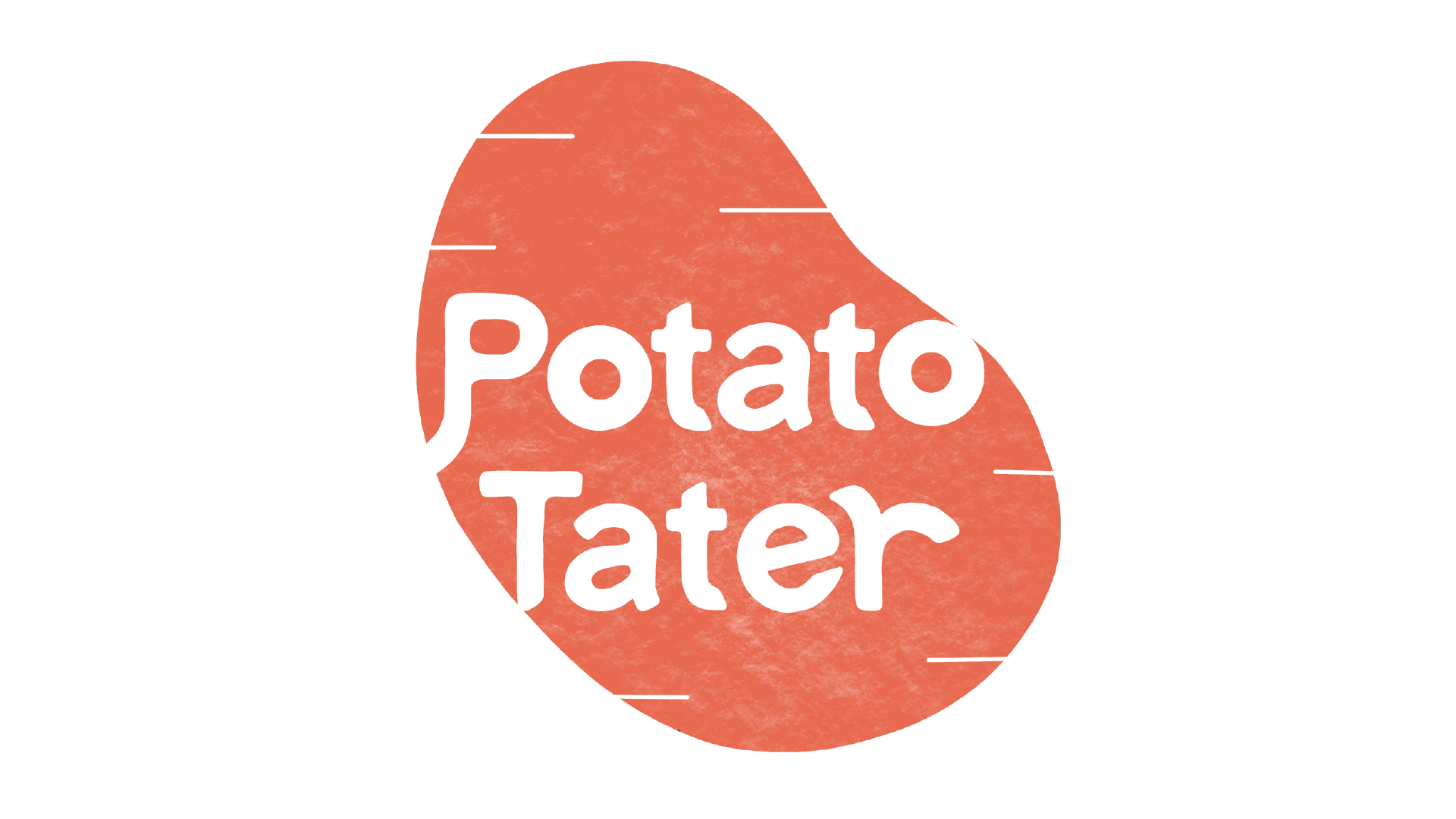
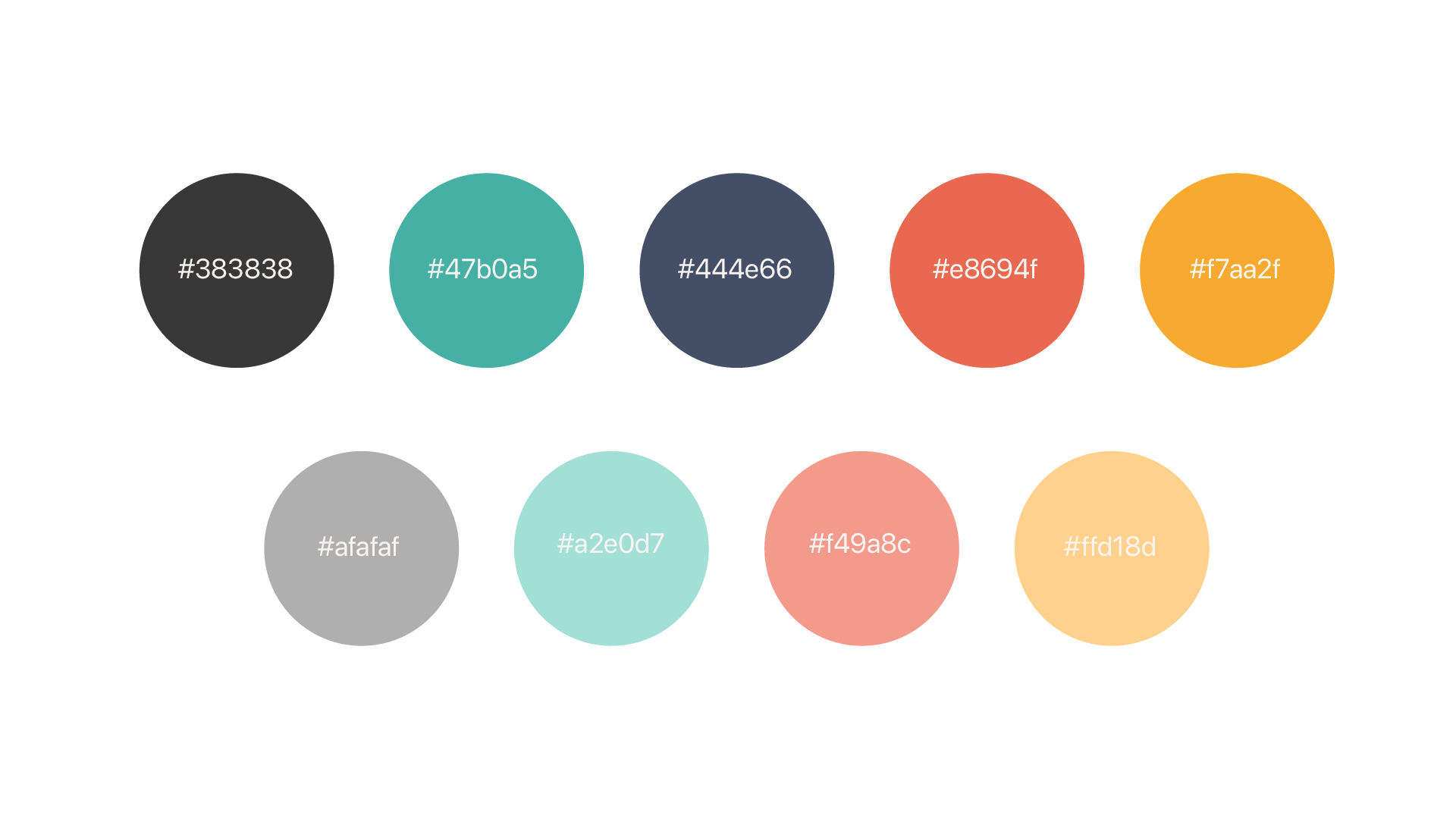
Procreate allowed me to take my pencil sketch and turn it into a digital drawing. I went back and forth working on both the logo design and color palette, because I knew the colors I used in the logo would set the tone for the brand as a whole. After fidgeting with the design for awhile, this is the logo and color palette I came up with.
PotatoTater logo
PotatoTater’s primary and secondary color palettes
Now that I had a logo and color palette, I wanted to find a couple of sans serif fonts with round edges, to help the brand appear fun and friendly. I went to Adobe Fonts and after scrolling for about an hour, I found two that went well with the brand identity and logo I had created. Here are the two fonts that I chose:
Signika Negative would be categorized as H1, with Nunito Bold being H2 and Nunito Regular being H3 (These are font hierarchy categorizations).
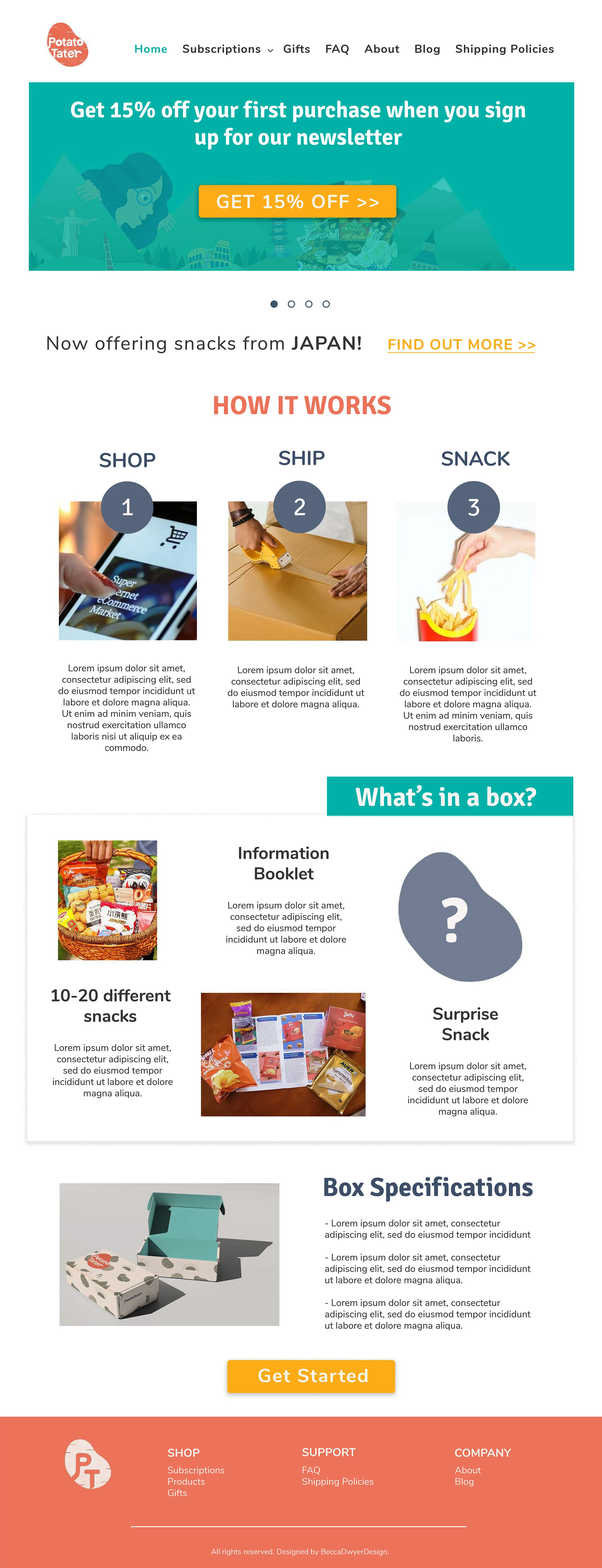
Using my color palette and fonts, I opened Photoshop and began to mockup two webpages for this fake PotatoTater brand. The first page they asked for was a homepage, with a banner advertising a discount when customers sign up for their newsletter. The second page was the product page, mostly consisting of images, descriptions, and membership prices. I’m not sure how to explain my process for mocking up these two pages, but I did start with the information first and design second. I made sure the hierarchy of my fonts remained consistent and that the eye was drawn to the most important information on each respective page. Here are the two webpages I fully mocked up in Photoshop.
So at this point, I spent the majority of my weekend creating all the deliverables asked for on the design test. I could’ve turned in the assignment here, but I decided to delve into the brand a bit further to help the marketing company visualize my concept. To do so, I created a fake instagram, mocked-up the webpage onto a computer, mocked-up a fake subscription box and designed the cover of an information packet, which is included in every hypothetical box. After creating all of these additional assets, I collected everything and put it into a PDF presentation using Adobe Illustrator.
Webpage mockup for PotatoTater.
Once I felt like everything was set and I could design no more, I sent my presentation to my friend LeeAnn, who also works on web and design projects. She helped edit my webpages and gave me suggestions on what to add and/or take away. I’m very grateful to have someone like her to go for feedback! After making my edits, I saved everything as a PDF presentation and emailed it back to the marketing company Monday morning.
PHEW
Are you exhausted, or is that just me?
A day after submitting my designs, the marketing company emailed me back with a quick “Thanks, unfortunately we’re moving on with other candidates”. This left me with a slew of questions: Did they like my idea at all? What did other candidates come up with? What didn’t they like? I wish I was able to have a discussion with them after turning in the test, so I could pitch my idea and we could talk through my decisions. But that feeling mostly comes from spending my weekend sweating over a test only to be told “no thanks” and left with nothing. No feedback for me to learn and grow from.
I knew the only way I would feel like my weekend wasn’t wasted was by turning the situation around and creating content from it, starting with a blog post. What you’re reading right now! I hope this gave you a little insight as to what it’s like applying for jobs as a designer and how much work goes into each project. Overall, I like my design, and that’s what matters most!


